SpiceBox Signature Packaging
Structural Packaging Brand System

SpiceBox Signature

A packaging format innovation that became the company's manufacturing standard for 15+ years — and a retail shelf disruptor.

Read case study →
I-Loom Ultimate Bracelet Maker
IP Acquisition Digital Product Hardware Redesign

I-Loom Relaunch

Reviving a dormant IP — hardware redesigned in 3D, a non-compliant app rebuilt from the ground up, and a legacy brand relaunched under SpiceBox.

Read case study →
Costco Pallet Programs
Retail Design Pallet Programs Costco

Costco Pallet Programs

Designing shoppable pallet displays for Costco USA/Canada — 20 years of programs averaging 90% sell-through in 8-week cycles.

Read case study →
Canada Soccer Style Me Up
Brand Licensing IP Strategy 2026 World Cup

Canada Soccer × Style Me Up

Pitching and executing a multi-SKU fan engagement program for Canada Soccer — timed to the 2026 FIFA World Cup on home soil.

Read case study →

Structural Packaging · Brand System

SpiceBox Signature

SpiceBox Product Development · 2005 onwards · 15-year manufacturing standard

My role
Creative Director & Designer
Scope
100+ SKUs
Result
15-year standard

The brief

Consumer product packaging in the toy and craft category had a problem: large boxes filled with air, cheap construction, and nothing to distinguish one brand from another on shelf. The brief was to create a packaging format that stood apart — not just visually, but physically. Something that felt worth keeping.

The design problem

Three retail realities were driving the challenge. First, shelf presence — in a Costco book table or a Michaels aisle, every competitor was fighting for the same rectangular face. Second, perceived value — craft kits at $20–$40 need to justify their price point the moment a consumer picks them up. Third, versatility — the format had to work across toys, crafts, EdTech, and gift retail simultaneously.

The solution

The SpiceBox Signature format took its cues from hardcover books and premium stationery rather than toy packaging. A portfolio-style structure with magnetic flap closures replaced the standard lift-off lid — the closure itself became a tactile signal of quality before the box was even opened.

The inside was engineered as a dual reveal: open the left panel and you see the instructional book; open the right and the components tray — held behind a large die-cut window — shows everything included at a glance. No guessing. No reading the back of the box. The entire value proposition was visible in under three seconds.

The format was also designed for secondary use. Once the kit was completed, the box itself served as a storage and display case — the first consumer product packaging I knew of that was engineered to stay in a child's bedroom rather than go in the recycling.

SpiceBox Signature — Clay Creations profile SpiceBox Signature — open view
Best Friend Bracelets — profile Best Friend Bracelets — inside

Retail fit

The format solved a channel problem that most packaging can't: it was equally at home in a Costco book table (spine-out, like a book), a Michaels craft aisle (face-out, window showing components), and an Indigo gift display (premium feel justifying gift positioning). One structural format, three retail environments.

Outcome

15+
Years as SpiceBox's primary manufacturing standard
100+
SKUs produced in the Signature format
3
Major retail chains — Costco, Michaels, Indigo
90%
Average Costco sell-through in 8-week cycles

IP Acquisition · Digital Product · Hardware Redesign

I-Loom Relaunch

Style Me Up acquisition · SpiceBox Product Development · 2018 onwards

My role
Creative & Product Lead
Scope
Hardware + App + Brand
Channel
Mass retail

What we acquired

The I-Loom was an innovative product concept — a physical bracelet-making loom that paired with a tablet app — but what we acquired through the Style Me Up IP purchase was essentially a broken asset. The app was non-compliant with current Apple and Google store standards, had been unsupported for years, and no longer functioned on modern devices. The physical loom hardware was sized for an earlier generation of tablets and was too small for anything manufactured in the last several years.

The brand value was real. The technology was dead.

The hardware challenge

The loom itself was a precision-engineered piece of injection-moulded hardware — redesigning it from scratch would have meant scrapping existing tooling worth significant capital investment. The challenge was to remodel it in Blender 3D to accommodate modern tablet dimensions while preserving as much of the original tooling geometry as possible, minimising retooling costs while delivering a product that actually worked with current devices.

This was one of the first projects where I used Blender's precision modelling capabilities for functional hardware design rather than just product visualisation — the digital prototype had to be accurate enough to drive tooling decisions.

Before & after

The original loom (left) was designed for an earlier generation of smaller tablets — compact but incompatible with current devices. The redesigned loom (right) accommodates most current Apple and Android tablets while preserving the core weaving mechanism that made the original distinctive.

Original I-Loom
Before
Redesigned I-Loom
After
I-Loom — packaging profile I-Loom — components flat lay

The app rebuild

Working with external developers, we rebuilt the i-loom app to current Apple App Store and Google Play compliance standards. The scope included removing obsolete features, updating the UI to reflect current platform conventions, and preserving the core interactive pattern tutorial functionality that made the original product distinctive.

The app paired with the loom via QR code, unlocking bracelet patterns and animated step-by-step tutorials — a physical-digital integration that was ahead of its time when first designed, and still differentiated when we relaunched it.

Brand relaunch

The product was relaunched under the SpiceBox brand with updated packaging in the Signature format. The i-loom name was retained for brand continuity with existing product awareness, while the SpiceBox identity provided the retail credibility needed for Costco placement.

I-Loom — inside packaging

Outcome

Full
App rebuild to current Apple & Google compliance standards
Min.
Tooling retooling — maximum original geometry preserved
2
Platform stores — App Store and Google Play
Live
Costco USA/Canada distribution post-relaunch

Retail Design · Pallet Programs · Costco USA/Canada

Costco Pallet Programs

SpiceBox Product Development · 2005–Present · 20-year vendor partnership

My role
Creative & Product Director
Account peak
$20M+ annually
Sell-through
90% avg / 8 weeks

What a pallet program is

A Costco pallet program is one of the most demanding retail design briefs in consumer products. A single SKU — typically a custom-built display tray or shipper — contains multiple individual titles. The display must be shoppable from all four sides, structurally sound enough to survive warehouse stacking, and visually coherent enough to read as a brand at a distance across a concrete warehouse floor.

Every element of the program is buyer-reviewed: the title mix, the tray design, the planogram, the individual packaging, the compliance labelling. There is no margin for error — a rejected program means a lost season.

The design challenge

Designing for Costco requires resolving a fundamental tension: the product must appeal to a Costco member standing 10 feet away (large format, bold colour, clear value signal) while also closing the sale for someone holding the individual title (quality feel, readable copy, component visibility).

The tray itself is a structural design problem — it needs to hold 6–12 individual units, remain stable at pallet height, and allow a member to pull a single title without destabilising the display. We designed and iterated the tray geometry across multiple program cycles to optimise both structural integrity and shoppability.

Kits for Kids Costco pallet — front view Kits for Kids Costco pallet — full view
Kits for Kids Costco pallet — side view

Pallet configuration & tray design

Each pallet program begins with a planogram — a precise specification of how titles are arranged across layers. The 2025 Young Artist program shows the complexity: 5 layers × 10 trays × 6 pieces = 300 units per pallet, packed in assortments to maximise visual variety from all four sides.

Young Artist Costco pallet configuration — front, profile, side

The tray itself is a structural design problem solved in cardboard. The Young Artist PDQ tray (394mm × 290mm × 292mm assembled) is engineered from 1.8mm E-flute corrugated, die-cut, scored, and folded — holding 6 titles at a forward-angled display position so titles are readable at warehouse height from a shopping distance.

Young Artist tray PDQ specs

The Canada Soccer program ran as a mixed pallet alongside the Young Artist range — visible evidence that the licensing program was designed from the ground up to integrate into an existing Costco retail system, not sit alongside it as an outlier.

Costco Canada Young Artist pallets — warehouse photos

20 years of programs

Sustaining a Costco vendor relationship for 20 years requires more than a good product — it requires consistent compliance, reliable sell-through, and the ability to refresh the program each cycle without losing the shelf equity built up over the previous one. We maintained year-round book table presence with 4–8 rotating SKUs, and ran multiple pallet programs simultaneously across Costco USA and Canada.

Outcome

20+
Years of continuous Costco USA/Canada vendor relationship
90%
Average sell-through rate within 8-week pallet cycles*
*Based on pallet programs in Costco Canada and USA
$20M+
Account peak annual revenue
4–8
Rotating SKUs in year-round book table programs

Brand Licensing · IP Strategy · 2026 World Cup

Canada Soccer × Style Me Up

Style Me Up / SpiceBox Product Development · 2024–2026

My role
Creative & Licensing Lead
SKUs executed
3 of 5 pitched
Channels
Costco, mass retail

The opportunity

With Canada hosting the 2026 FIFA World Cup — the first time the tournament has been held on Canadian soil — the fan merchandise opportunity was significant and largely untapped at the mass retail level. Most licensed product was adult-focused apparel. We identified a gap: family and kids fan engagement kits that combined Canada Soccer's brand equity with the craft and activity kit format we'd perfected over 20 years.

We approached Canada Soccer directly with the pitch. The licensing relationship was built on our track record of delivering compliant, shelf-ready product at Costco scale.

What we pitched

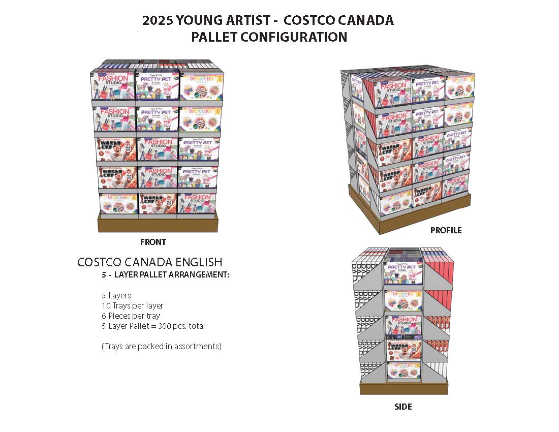
We developed five distinct product concepts for the initial pitch: a Family Pack, a Rally Pack, a Watch Party Pack, a Costco Club Activity Kit, and a Style Me Up Art Kit. Each was designed as a different price point and retail channel entry — from Costco pallet to specialty gift retail.

Three were greenlighted for execution: the Style Me Up Art Kit, the Rally Pack, and the Costco Club Activity Kit.

Compliance constraints

Licensed sports product operates under strict brand compliance rules that shape every design decision. Key constraints for this program included:

No direct FIFA World Cup references in editorial or marketing copy — the rights to that phrase are held separately from the Canada Soccer mark. Every headline, subhead, and call-to-action had to capture the tournament energy without naming it.

No player names or likenesses — fan product had to celebrate the team and the sport rather than individual athletes, requiring a design approach rooted in the Canada Soccer visual identity rather than personality-driven imagery.

Strict logo placement and usage rules — the Canada Soccer badge could only appear in approved colourways, at approved minimum sizes, and in approved spatial relationships with other brand elements.

The products executed

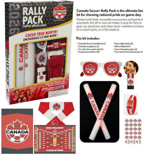
The Rally Pack (below) demonstrates the compliance approach in practice — bold Canada Soccer red and white, the official badge prominently placed, fan accessories including headband, sunglasses, foam light sticks, LED wristband, and tournament bracket poster. All copy carefully avoids direct FIFA World Cup references while unmistakably capturing the tournament moment.

Canada Soccer Rally Pack — fan engagement kit
Canada Soccer Style Me Up — profile Canada Soccer Style Me Up — open

Design approach

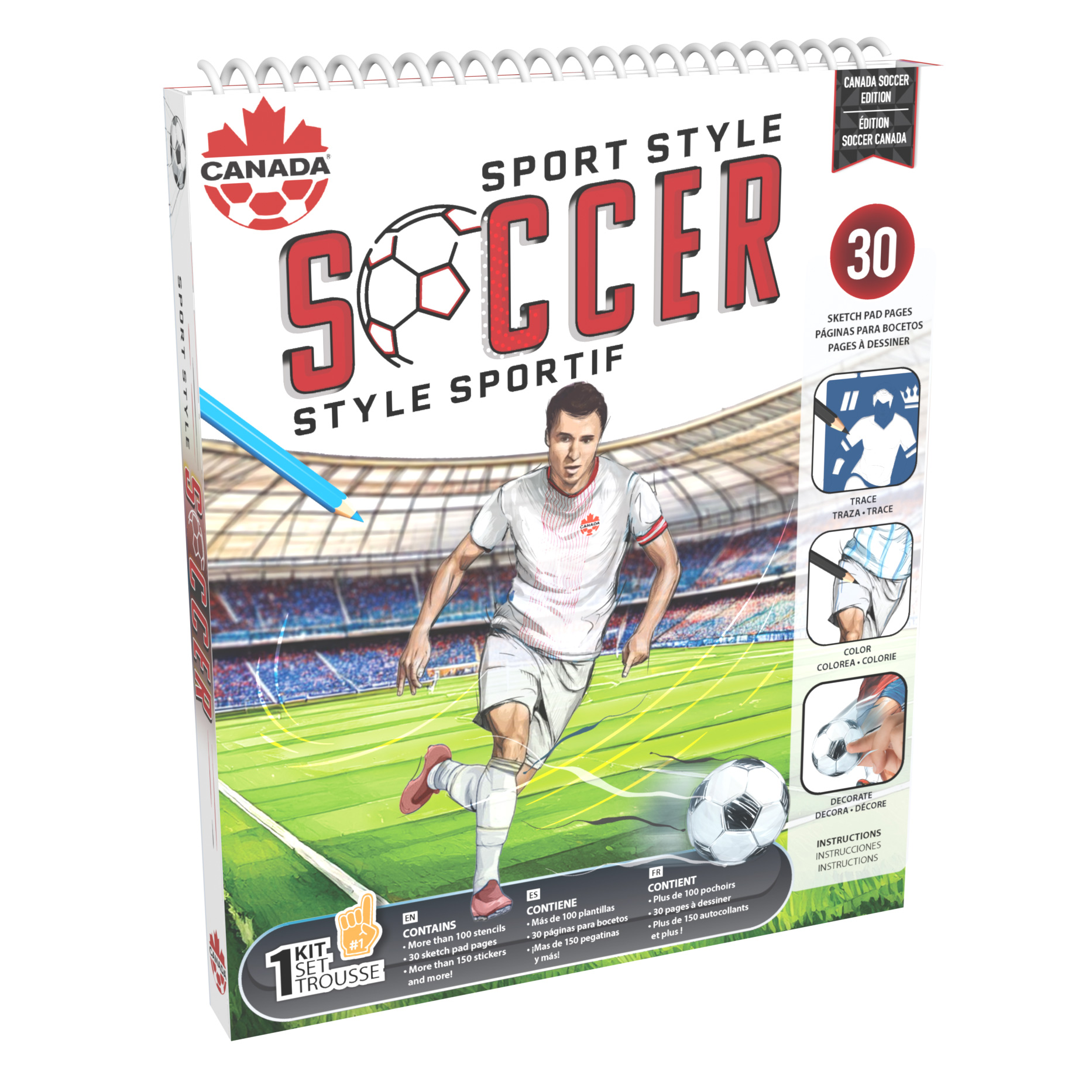
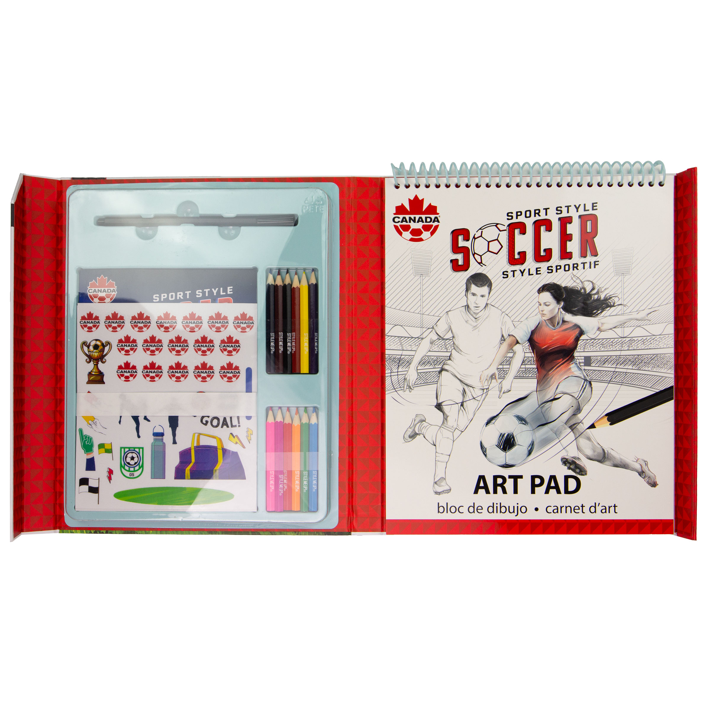
The Style Me Up Art Kit used the Canada Soccer visual identity as a design system — the red and white palette, the maple leaf motif, and the dynamic sports photography treatment — applied to the Style Me Up brand architecture. The result was a product that felt authentically Canadian and authentically sporty without relying on any restricted marks.

The packaging had to work in both English and French across all markets, adding a bilingual design constraint that affected typography hierarchy and copy length across every panel.

Outcome

3/5
Pitched concepts greenlighted for production
Live
Retail distribution timed to 2026 World Cup
3
Retail channels — Costco, mass retail, specialty
First
Canada Soccer licensed craft & activity kit program